


Table of contents
This article will be solely based on the position property of the CSS.
The CSS position property defines the position of an element in a document, basically.
There are five different types of position properties available in CSS.
- Static
- Relative
- Absolute
- Fixed
- Sticky
The positioning of element can be controlled by using top, bottom, right & left properties. To use the mentioned properties, we have to set the position method.
<!DOCTYPE html>
<html lang="en">
<head>
    <meta charset="UTF-8">
    <meta http-equiv="X-UA-Compatible" content="IE=edge">
    <meta name="viewport" content="width=device-width, initial-scale=1.0">
    <title>Position | CSS</title>
    <style>
        body{
            height: 200vh;
        }

        p{
            text-align: center;
        }

        .box{
            display: inline-block;
            border: 2px solid red;
            width: 150px;
            height: 150px;
            margin: 2px;
        }

        #box3{
            position: absolute;
            top: 200px;
        }

    </style>
</head>
<body>
    <div class="box1"></div>
    <div class="box2"></div>
    <div class="box3"></div>
    <div class="box4"></div>
</body>
</html>
The page will look like this when you run it.
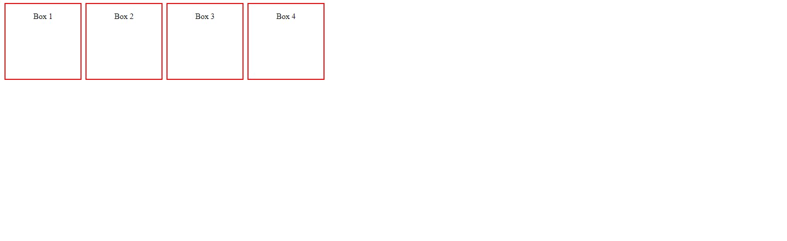
I'll be using this code for the explanation of position. I'll be writing styles in style tag in examples of the types explained below and I would like you to try to apply the concepts after you've read the article.
1. Static
This is the default positioning set by the HTML itself.
If the positioning method is undefined by the developer. Then, this positioning property will be assumed by the HTML page.
The element will be positioned according to the flow of the page.

same as the document.
2. Relative
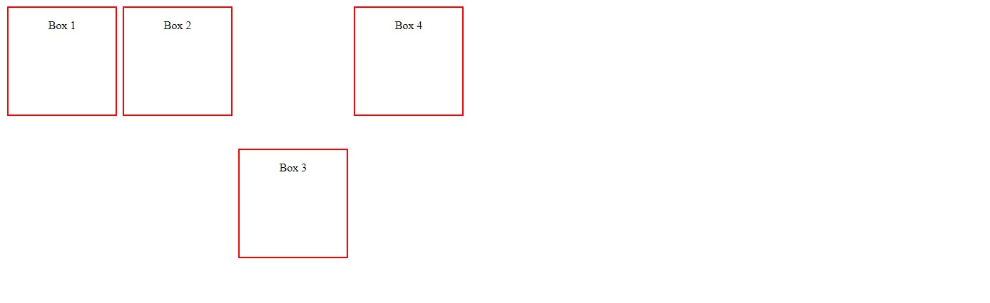
An element with position: relative is positioned relatively with the other elements which are sitting at top of it. If we set its top, right, bottom, or left, other elements will not fill up the gap left by this element. An element with its position set to relative and when is adjusted using top , bottom ,left, right will be positioned relative to its original position.
Simply, positions the element relative to its normal and it will leave a gap at its normal positions, if we try to move it.
for example: if I try to move box no. 3 from its position using relative positioning. Then it would leave a gap in its previous position.
   #box3{
            position: relative;
            top: 200px;
        }
put this code in the style tag of above mentioned code for the out below & same for all the examples.
3. Absolute
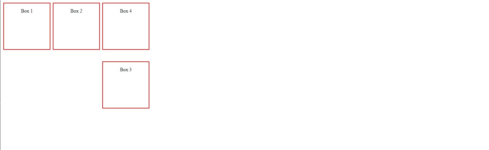
An element with position: absolute will be positioned with respect to its nearest Non-static ancestor. The positioning of this element does not depend upon its siblings or the elements which are at the same level.
Don't be scared by this above definition, it positions the elements relative to its own position of its first parent.
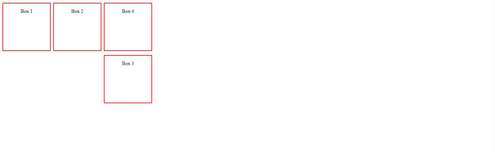
for example: if I try position the box no. 3 acc. to absolute positioning. As we mentioned above, that element with absolute position positions itself acc. to its parent. now, in the html code provided at beginning, who is the parent of the div which is being positioned?
You're right. The HTML body itself is the parent of the <div class="box" id="box3"> tag.
        #box3{
            position: absolute;
            top: 200px;
        }
So, you'll see here it'll leave no gaps unlike positioning using relative positioning.
4. fixed
Any HTML element with position: fixed property will be positioned relative to the viewport. An element with fixed positioning allows it to remain at the same position even we scroll the page.
Another, scary definition, I know. In layman terms, It positions the elements relative to the browser and it remains in that position even on scrolling.
It's same like noticed some chat icons given at the right-lower end of many web pages.
for example: if I set the position property of the box element in above examples to fixed position property. Then, the element will stick to it when you scroll
   #box3{
            position: fixed;
            top: 175px;
        }
Now, I'll paste the screen shot of the output received on running the code but I'll suggest you to run the code on your PC or laptop whatever to see the magic.
well, on scrolling the box 3 will remain as it no matter how much you scroll it.
5. Sticky
Element with position: sticky and top: 0 played a role between fixed & relative based on the position where it is placed. If the element is placed at the middle of the document then when the user scrolls the document, the sticky element starts scrolling until it touches the top. When it touches the top, it will be fixed at that place in spite of further scrolling. We can stick the element at the bottom, with the bottom property.
This position property follows the rules of both relative & fixed position properties.
if I'll run the code below. then, It would appear as the same output as the relative positioning property as we did earlier.
     #box3{
            position: sticky;
            top: 175px;
        }
But there's a twist, and you'll come to know of it when you scroll & I would suggest you try this magic on your own.

Well, I hope that I was able to explain the concept clearly to you.
Thanks for reading.